I saw this question here which sort of presented a solution at Github https://github.com/elementor/elementor/issues/4960 but nothing was explicitly listed out. So I wrote this step by step guide to help anyone who got stuck.
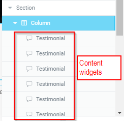
1 – Make your section, columns and put all your widgets in 1 column.
2 – When making content widgets, make sure all the content widgets (“testimonials” in the example below) have a class name. In our example, we use “custom-flex-box” as class

Click on the content widget. Advanced. CSS Classes.

You need to add this class to ALL content widgets.
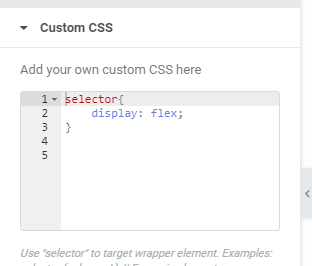
3 – Click on Column, “Advanced” tab, “Custom CSS” box. Type in the following:

selector{
display: flex;
}

3 – In CSS, add the following code for 3 widgets per row:
.custom-flex-box{
width:33% !important;
padding: 20px 20px !important; /* added this for some extra spacing between each widget so it looks better - feel free to adjust */
}
4 – Save and check on PC that it is showing 3 per row instead of 1 per row.
If it does not show properly, then you got an issue. Make sure all the class names are set correctly.
5 – Now what if you want to set different 2 widgets per row for smaller screens? Easy. Use media queries.
@media only screen and (max-width : 767px) {

.custom-flex-box{
width:50% !important;
}

}
6 – check on responsive mode that this works (it should!)
7 – want different spacing / gap? Look at #3 above and adjust the padding code as you wish.
That’s it!